


Exhibition at TBC Concept Gallery — Tbilisi — Risingland

Ubani — Tbilisi Cityscape Research Center and TBC Concept Gallery invite you to the exhibition Tbilisi — Risingland. The exhibition presents the outcomes of a work focused on critical representations of the geological intimacy of Tbilisi through the creation of three-dimensional hand-made models.
The exhibition showcases handmade works created during last year’s seminar organized by Ubani and led by Italian architect and theorist Renato Rizzi, including an orthogonal model of Tbilisi with increased verticalities that create an intensified perspective, a model of Metekhi Cliff that explores the interiority of the city’s elevations, silicone negatives, photographs, and two panels: one panel features isometric images of Tbilisi, while the other displays each of the full-page spreads from L’Ottava Vita (per Brilka), a book by Nino Haratischvili. This pairing connects to the project’s core theme: a dialogue between architecture and literature that both emerge from the same historical and geological landscape.
The seminar was held in September 2025 as part of Ubani — Tbilisi Cityscape Research Center’s educational program and was led by Italian architect and theorist Renato Rizzi, together with his assistants Susanna Pisciella, Giorgia Antonioli, and David Brodsky. The seminar involved around 100 participants- both local and international students and young professionals.
Ubani — Tbilisi Cityscape Research Center is a non-profit organisation with the mission of gathering and presenting knowledge about Tbilisi’s landscape, architecture, and urban environment.
Renato Rizzi is an architect and educator based in Venice, Italy. He is a full professor of architectural design at IUAV University of Venice and a member of the Accademia Nazionale di San Luca in Rome. In 2018, he received the Italian Republic Award.
Project partners: Embassy of Italy in Georgia; Kinos Hub; Gravita; ibis Budget Tbilisi Center; IUAV University of Venice; Apollon Kutateladze Tbilisi State Academy of Arts; Ilia State University (IIiauni B.Arch)
A special thank you to Marsilio Editori (Italian publishing house), VA[A]DS Free University of Tbilisi, Jesse Vogler, and Malkhaz Lekveishvili.
As part of the exhibition, a lecture by Renato Rizzi will be held on February 28 at 19:00. To attend, please register via the following link: https://www.conceptevents.ge/
Exhibition opening: Saturday, February 28, 5 pm.
The exhibition will be hosted by the multifunctional space of TBC Concept (7 Marjanishvili Street) until April 24.
With many years of experience, TBC Bank actively supports cultural projects that serve the preservation of national values, the development of Georgian art, and the promotion of cultural heritage.
TBC Concept Gallery creates a space for dialogue between art, education, and research. The project Tbilisi — Risinglandbelongs precisely to those initiatives that bring new meaning to the city’s cultural and intellectual life and share international experience with young professionals.

Other News
 Geosky Airlines Successfully Completes Rebranding Full Transformation of the Brand’s Visual Identity
27.02.2026.15:24
Geosky Airlines announces the successful completion of its rebranding process initiated in 2025. The project encompassed a comprehensive transformation of the company’s visual identity and the introduction of a new primary brand symbol — the Lion — established as the airline’s principal identifying mark.
2017 — From National Identity to International Ambition
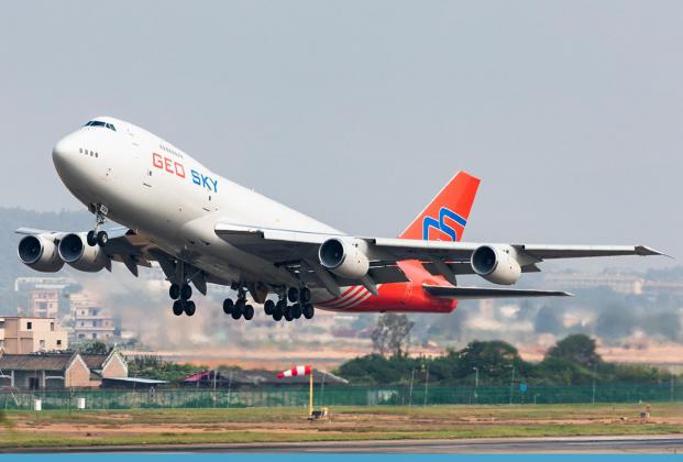
Founded in 2017, Geosky Airlines’ original visual identity reflected its Georgian heritage. The logo featured the outline of the map of Georgia, accompanied by the “Geo Sky” wordmark rendered in red and blue. The fleet livery was distinguished by a red vertical stabilizer bearing the “GS” abbreviation, which quickly became a recognizable brand element in international airspace — particularly on the Boeing 747-200F freighter aircraft that operated for many years across European and Asian routes.
The brand’s initial objective was to establish a corporate visual identity that preserved the red and blue color palette while modernizing its visual language in line with contemporary design and aviation industry standards.
2022 — Strategic Transformation
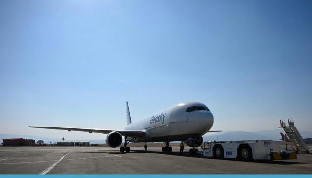
In 2022, the red color was fully removed from the brand guidelines and replaced with a refined indigo-blue tonality — a color associated with trust, professionalism, and technological maturity. The company name was consolidated into a single word — Geosky — underscoring brand unity and international positioning.
The updated logo architecture was built around a paper airplane motif integrated into the letter “Y.” This element conveyed lightness and upward motion, while its structured composition — defined by clean lines and precise angles — reflected Geosky’s operational accuracy and flexibility in partnership. The typography evolved into a bold yet elegant form with subtly rounded corners, reinforcing the brand’s accessibility and its human-centered business philosophy.
The earlier concept of an aircraft emerging from the letter “G” was reinterpreted through a new visual language emphasizing balance between form and negative space, incorporating dynamic shapes that communicate movement and forward momentum.
2026 — A New Symbol of Brand Identity
As the final phase of the rebranding process, in 2026 Geosky introduces a new core brand symbol — the Lion. The Lion embodies strength, safety, leadership, and strategic confidence.
Its mane is inspired by the traditional Georgian Borjgali symbol — representing perpetual motion and continuous development. The dynamic lines of the mane visually echo the motion of a jet engine, symbolizing sustained energy, progress, and technological capability. The Lion symbol now enhances the corporate livery of Geosky Airlines’ aircraft, marking a new chapter in the airline’s evolution.
Beginning in March 2026, the Boeing 767-300F freighter aircraft in the fleet will operate under the fully updated branding — featuring a modern, minimalist, and instantly recognizable visual identity.
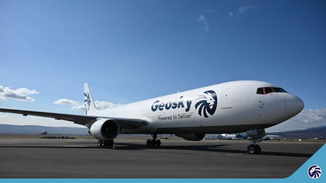
Geosky — Powered to Deliver
The rebranding represents more than a visual update. It is the natural progression of the airline’s development — energy in motion, strategic expansion, and responsibility toward every shipment, partner, and destination. “Powered to Deliver” encapsulates the philosophy of Geosky Airlines: energy, professionalism, and continuous advancement.
Geosky Airlines continues to operate in strict compliance with the highest safety standards, guided by the same principles that have underpinned its success since inception: reliability, operational precision, and sustained growth.
 TAV Georgia General Manager Tea Zakaradze met with the delegation of France’s largest business association, Mouvement des Entreprises de France
24.02.2026.13:59
TAV Georgia General Manager Tea Zakaradze met with the delegation of France’s largest business association, Mouvement des Entreprises de France
24.02.2026.13:59
 SOCAR LAUNCHES THE SOUTH CAUCASUS’ FIRST FULLY ELECTRIC EV CHARGING STATION IN GEORGIA
20.02.2026.16:47
SOCAR LAUNCHES THE SOUTH CAUCASUS’ FIRST FULLY ELECTRIC EV CHARGING STATION IN GEORGIA
20.02.2026.16:47
 Our Goal Is to Become Georgia’s Leading Hotel - New General Manager of Le Méridien Batumi
13.02.2026.18:00
Our Goal Is to Become Georgia’s Leading Hotel - New General Manager of Le Méridien Batumi
13.02.2026.18:00
 Ambassadori Island Batumi to Deliver a High-Quality Urban Environment and Sustainable Ecosystem – ARUP
09.02.2026.14:03
Ambassadori Island Batumi to Deliver a High-Quality Urban Environment and Sustainable Ecosystem – ARUP
09.02.2026.14:03
 Ambassadori Island Batumi Allows Us to Fully Realize Our Decades of Engineering Expertise – Yüksel Proje
09.02.2026.12:36
Ambassadori Island Batumi Allows Us to Fully Realize Our Decades of Engineering Expertise – Yüksel Proje
09.02.2026.12:36
 The former Medical Director of the Centers for Disease Control and Prevention (CDC), Mitchell Wolfe, visited BioChimPharm’s Phage Factory
06.02.2026.13:33
The former Medical Director of the Centers for Disease Control and Prevention (CDC), Mitchell Wolfe, visited BioChimPharm’s Phage Factory
06.02.2026.13:33


